
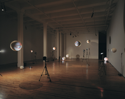
 His installation arent quite in the same sphere and woodfine and melies however there is definate visual reference, this spherical face thing and the way their set up minics a solar system.
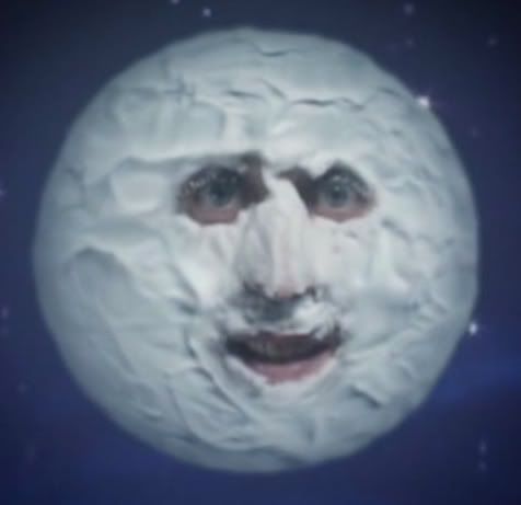

 28th of march : have just watched a programme about early cinema and have bumped into this on youtube and cant believe how much it reminds me of sarahs drawings. it has exactly the same kind of vibe and the music with it is just what i want describe sarahs drawinds to be apart from maybe a bit more melanchonic. their such such beautiful films. im really getting into film in a vewry big, the moving image and the sound pieces. I dont think static objects quite cut it for me. Im not making cultural references as well like the mighty boosh using the moon how it has entered pop culture again and the tony ouseluer things we saw in barcelona. things influencing each other. When observing the mighty boosh moon in comparison we can see the pop piss take made out of shaving foam.....yellow teeth.
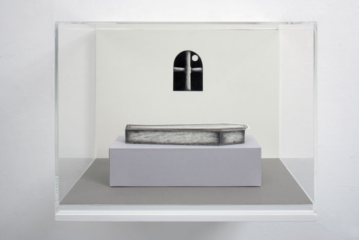

I dont know why i havent looked sooner, but its so sad.
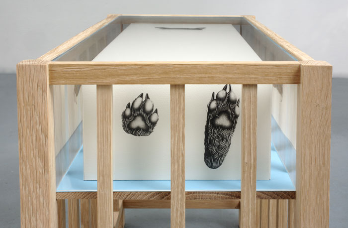
It looks like a coffin inside a crib with a bear in it. Theres such a great sadness in her work. Although I do think Im looking because I know she is a perfectionist. Everything is made immaculately. I need my work to be like this. Or actually DO i want my work to be like this? Woodfine and Ireland go on about all the samples being in straight lines, clinical woodfine says. I cant tell whether their right or not. Im spending ages trying to make them all straight when i dont even know if it will make any difference. Spoke to Soraya at the tutorial and she says no their fine the way they are and that the art is already done i just need to frame it and its done. She says that art doesnt have to all be analy straight because thats not what arts about.
I need to make a decision and work out what is important. The maquette one (which has turned into a maquette because the lines arent straight and the papers grey) does seem a bit strange when i look at it. like its not perfect or something. or somethings wrong. It seems impossible to try and get them all straight tho. I cant make them look like a machine has done it because i am not a machine! Sara came and looked at it and said she liked it because it looked really mechanical because of the nature of the samples but also relaly orgainic because of the placement.
Shit.
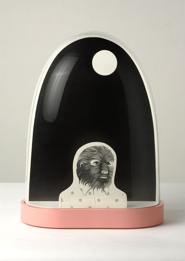
I dont think this fruit is as sad as other pieces. Sarahs really dark areas in her drawings make them really dark. even when being photogrpahed. or are they photoshoped? its so dark its like theres no end to it, like in tysons hole in the table....no was that dexter? the void.
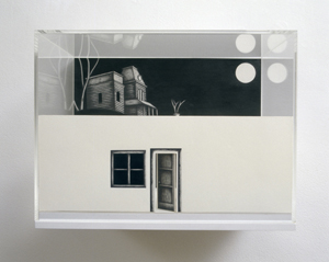
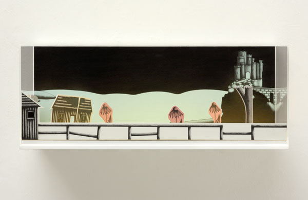
Its almost chidlike because its cartoony but the subject matter is so much darker than that. it is like cartoons for adults. Theres also a type of frame everytime to hold the place together. so it looks like a world away from this world.
Theres a yellow road one which i cant copy to put in here but the colour of the path and flowers contrasts that balck so much in that one that it makes the black even blacker. and scarier.
No comments:
Post a Comment