Sunday, 7 March 2010

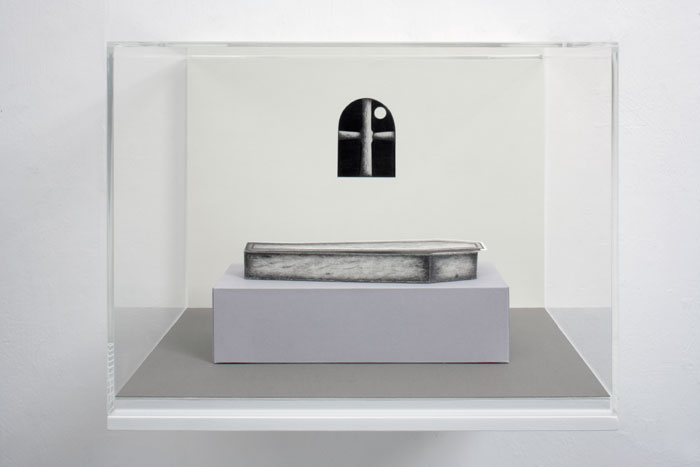
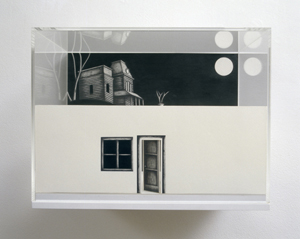
THE MOON - HRH SARAH WOOFINE & GEORGE MELIES TRIP TO THE MOON - THE MIGHTY BOOSH AND TONY OURSLEUR


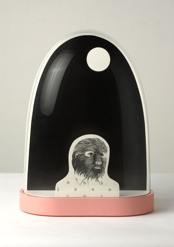
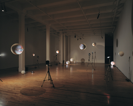
His installation arent quite in the same sphere and woodfine and melies however there is definate visual reference, this spherical face thing and the way their set up minics a solar system.


28th of march : have just watched a programme about early cinema and have bumped into this on youtube and cant believe how much it reminds me of sarahs drawings. it has exactly the same kind of vibe and the music with it is just what i want describe sarahs drawinds to be apart from maybe a bit more melanchonic. their such such beautiful films. im really getting into film in a vewry big, the moving image and the sound pieces. I dont think static objects quite cut it for me. Im not making cultural references as well like the mighty boosh using the moon how it has entered pop culture again and the tony ouseluer things we saw in barcelona. things influencing each other. When observing the mighty boosh moon in comparison we can see the pop piss take made out of shaving foam.....yellow teeth.


I dont know why i havent looked sooner, but its so sad.


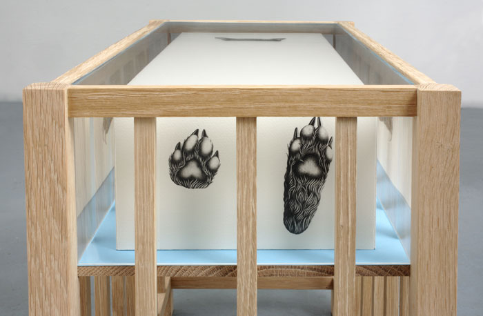
It looks like a coffin inside a crib with a bear in it. Theres such a great sadness in her work. Although I do think Im looking because I know she is a perfectionist. Everything is made immaculately. I need my work to be like this. Or actually DO i want my work to be like this? Woodfine and Ireland go on about all the samples being in straight lines, clinical woodfine says. I cant tell whether their right or not. Im spending ages trying to make them all straight when i dont even know if it will make any difference. Spoke to Soraya at the tutorial and she says no their fine the way they are and that the art is already done i just need to frame it and its done. She says that art doesnt have to all be analy straight because thats not what arts about.


I need to make a decision and work out what is important. The maquette one (which has turned into a maquette because the lines arent straight and the papers grey) does seem a bit strange when i look at it. like its not perfect or something. or somethings wrong. It seems impossible to try and get them all straight tho. I cant make them look like a machine has done it because i am not a machine! Sara came and looked at it and said she liked it because it looked really mechanical because of the nature of the samples but also relaly orgainic because of the placement.


Shit.


I dont think this fruit is as sad as other pieces. Sarahs really dark areas in her drawings make them really dark. even when being photogrpahed. or are they photoshoped? its so dark its like theres no end to it, like in tysons hole in the table....no was that dexter? the void.


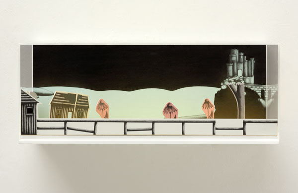
Its almost chidlike because its cartoony but the subject matter is so much darker than that. it is like cartoons for adults. Theres also a type of frame everytime to hold the place together. so it looks like a world away from this world.


Theres a yellow road one which i cant copy to put in here but the colour of the path and flowers contrasts that balck so much in that one that it makes the black even blacker. and scarier.


MATHIEU MERCIER


I am particularly interested in the way he has used packaging. He is using the brands to discuss deeper undertones. He is referencing academic forms of structures, this is fine but Im not sure if i want to do that within my work. It is his choice in packaging and using these brand names as objects which i find interesting.


HAIM STEINBACH


From Sculpture today:

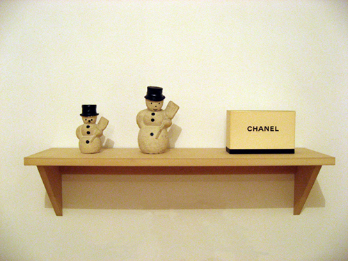
In the early 1980's his work consisted of shelves on which he set objects borrowed from hisa friends. He was interested in the way the context of the object changed when it was moved from a private to public spehre. Around 1984 he started showing his work on his signature shelves on which he placed brand new objects purchased from supermakeyts and department stores. His work madwe reference to the way in which objects are slecetedm arranged and displayed in commercial retail context.


I think from todays reserch this is the artist I love the most at the moment., Wan said in her talk that appropriating isnt enough for her, but it is for me. It is interesting to see how these objects relate and why the artist has chosen them to go together. Making connections between things. This is exactly what I want to do in my work. I dont have much to say on this at the moment but I will be doing more research on him.

MIKE KELLY


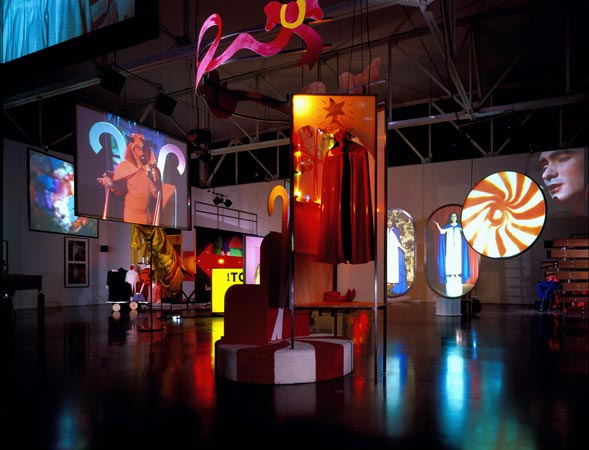
"Kelley’s work ranges from highly symbolic and ritualistic performance pieces, to arrangements of stuffed-animal sculptures, to wall-sized drawings, to multi-room installations that restage institutional environments (schools, offices, zoos), to extended collaborations with artists such as Paul McCarthy, Tony Oursler, and the band Sonic Youth.
His work questions the legitimacy of ‘normative’ values and systems of authority, and attacks the sanctity of cultural attitudes toward family, religion, sexuality, art history, and education. He also comments on and undermines the legitimacy of the concept of victim or trauma culture, which posits that almost all behavior results from some form of repressed abuse."

"KELLEY: "Day is Done" is built around the mythos that relates to "Educational Complex" and the history of a kind of symbolist attempt at uniting all the arts. "Educational Complex" is a model of every school I ever went to, plus the home I grew up in, with all the parts I can’t remember left blank. They’re all combined into a new kind of structure that looks like a kind of modernist building. I started to think about this structure through the Gesamtenswerk, the ‘total artwork’, of Rudolf Steiner, where he tries to combine all the arts and develop a kind of rule system according to which every art form is related. So the architectural relates to the dance relates to the music relates to the writing. But it’s also a kind of religion. And so my religion for this structure is repressed memory syndrome. The idea is that anything you can’t remember, that you forget or block out, is the byproduct of abuse and that all of these scenarios are supposed to be filling in the missing action in these blank sections in this building. It’s a perverse reading of [Hans Hoffman's] push-pull theory. "

ART:21: What is your source material for "Day is Done?"

KELLEY: All the scenarios for "Day is Done" are based on images found in high-school yearbooks in this particular case, though I’ve also done a whole collection of similar kinds of images from the small-town newspaper of the town where I grew up. The particular categories had religious ritual overtones, but outside of the church context. They all looked like they were done in public places, or they had gothic overtones. So I said, “Okay, I’m going to work with these particular groups of images and develop a kind of pseudo-narrative flow.” The rituals run the gamut from something like dress-up day at work to St. Patrick’s Day or Halloween, to a community play or an awards ceremony. So all I have is this image, and then I have to write a whole scenario for it like a play, and then do the music and everything. Each one is just based on the look of the photograph that tells me what style it has to be done in.

ART:21: How do you expect viewers to respond to this work?

KELLEY: I know that people don’t look at art like that, and I don’t expect people to know any of this stuff. And I don’t care if they do or don’t, because you have to make an artwork so it can be enjoyed on the most surface level, but I want for the more dedicated art viewer to be able to get the secondary and third levels of meaning. It has to operate on multiple levels: it has to be available to the laziest viewer on a certain level, and then on a more sophisticated level as well.


ART:21: Do you find this project humorous?

KELLEY: I think that’s the joyfulness of it. But then it’s a black humor, it’s a mean humor, so it’s a critical joy. You know, it’s negative joy. (LAUGHS) But that’s art I think—for me at least. That’s what separates it from the folk art that I’m going to. I think the social function of art is that kind of negative aesthetic, otherwise there’s no social function for it. You don’t need art then. Television can do the same thing.


I was more interested in the kind of popular material that they were working with, which was the lowest of the low, rather than New York pop art which tended to be more mainstream, like Warhol’s Campbell Soup cans and very standard Americana kind of imagery. I was more interested in that kind of ‘sub-stuff’.

ART:21: You’ve always been interested in Marxism...

KELLEY: Very much so, yes. Always, my interest in popular forms was not to glorify them—because I really dislike popular culture in most cases. I think it’s garbage, but that’s the culture I live in and that’s the culture people speak. I’m an avant-gardist. We’re living in the postmodern age, the death of the avant-garde. So all I can really do now is work with this dominant culture and flay it, rip it apart, reconfigure it, expose it. Because popular culture is really invisible. People are really visually illiterate. They learn to read in school, but they don’t learn to decode images. They’re not taught to look at films and recognize them as things that are put together. They see film as a kind of nature, like trees. They don’t say, “Oh yeah, somebody made that, somebody cut that.” They don’t think about visual things that way. So visual culture just surrounds them, but people are oblivious to it.

BROUGHT UP AS A CATHOLIC. RITUAL ART = MATERIAL RITUAL FOR HIM. HE ALSO WAS NEVER A BELIEVER....TO DEVELOP A MATERIALIST RITUAL.
STUFFED ANIMALS COMODITY CULTURE BUT PPL THOUGHT IT WAS CHILD ABUSE. NOT EXPECTED. THEY THOUGHT PERSONAL ABSUE. HE STARTED MAKING WORK ABOUT HIS ABUSE, ABOUT EVERYONES ABUSE, OUR SHARED CULTURE. THE PRESUMPTON THAT ALL MOTIVATION IS BASED ON REPRESSED TRUAMA. HE DOESNT REJECT RESPONSES, HE RUNS WITH THEM. IT TELLS HIM WHAT TO DO. WORKS WITH MANY DIFFERENT TROPES. MUSIC, PERFORMATIVE. SENSE ALWAYS COMES AFTER THE FACT IN HIS WORK. HAS TO OPERATE ON MANY LEVELS, HAS TO OPERTATE TO THE LAZIEST VIEWER, ON A CERTAIN LEVEAND THEN A MORE SOPHISICATED LEVEL AS WELL.


A REVIEW:

The installation of the Mike Kelley retrospective at the Whitney Museum of American Art is crowded. There’s too much to see, even for the repeat visitors, the fans, me. At the opening, a friend complained to me that the cram-in-as-much-as-you-can installation severely compromised the show. ‘the afghan piece with the bumps’ - Lumpenprole 1991 - ‘could be so beautiful, but all this other junk detracts from the image. It almost makes me think Mike Kelley isn’t as great an artist as I’d always thought he was.’

Another artist, a friend of mine and a fan of Kelley’s work, told me when i said I was having a hard time digesting the plenitude of Kelley’s retrospective, ‘It’s all about generating ideas, so many ideas going on when most artists stake entire careers on just one idea, repeated over and over again ad nauseam.’

There is little to be gained in inventing a new language when no-one can understand you; the innovations neccessarily come from within pre-established forms, even if the hidden agenda is the destruction of those very forms.

SYLVIE FLEURY


I really love this work. I am partcularly interested in how she started off talking about consumerism etc and has now moved onto male stereotyped work. e.g. cars and rockets etc. I find myself reading alot of male dominated magazines. i find them alot more intellectually sitmulating and I would be interested in more masculine materail matter. What makes her work "art?" and not just shopping. setting these situations up. the shoe boxes make the plynths for the shoes. Taking found objects ad remaking them into fine art objects. remaking dog toys, and car batteries and machines etc. really making us question by using the title to ask what are these things we are buying? It would be impossible for me to make this work as I would enver have the money to buy these shoes. im not getting as much out of this as i did from demand....

The golden tyre is my favourite. and spraying the shopping thing gold. I am beomcing obsessed with objects being gold. being given some sort of authority. or being sprayed gold alsmot giving them a higher status. Very interested in that. the surface.....of gold........Making something worth more than its actually worth or at least symbolising that you want it to be worth more through changing its surface colour.

ive noticed the shopping trollies would be spinning round like in a shop. I think this is also what russeell is interested in to. which is why he got the microwave plate. this spinning notion to make it look more desirable. Was at Tysons and they have a spinning thing to, nick pointed out that maybe it was going to fast for a box of matches and its that thing of there being a specific speed for each object to make it look desirable.

and what is this spinning thing about? whats the psycology behind it? why do we like it to spin?

THOMAS DEMAND


I still cant decide whether I am interested in this work or not. I think I am. I think it is recreation of the still life. Hes remaking objects from paper to creeate situations to photograph.
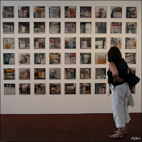
His photos look like those perfect imperfections whcih i collect from B&Q and this is kind of what mkaes the work look shit. It is obvious that all the objects are made from paper, which is what makes you question about surface. yes this work is about surface and still life. His placement of things are too concidered however I dont know how much he ewants it to look real. if they objects look so unreal because of the nature of material then surely it doesnt matter if the placements also look a bit fake. in fact it could be argued that the placement has to look as fake as the objects for it to work? otherwise it would be too confusing.
When you know theres it fakes then theres no clue to the scale, you start to think about the prcoess of how it was made and question how much of the whole thing is real. which bits are real. are these images hes representing from REAL situations? or has he made them up? does he work from photogrpahs? how much is real and more much is fake? nice. i do really like this work actually. |There has been no attempt to add in detailof making it too look real, like fischli and weiss try to add everything little detail. for them it is about it being as real as is it in real life. here Demand uses the look of fakeness to make the viewer question which elements of this siutation are real and not. They are "trying" to be real though. like the pages scattered around.

Hes chosen situations which if they were to exist in real life would be quite mundane. theres alot of situations which deal wth the workplace. everydayness. the exterior ones puzzle me. When he doesnt do just close ups of obhjects, he does full on scenes, again you would expect it to be redone same size but hes probably done it tiny.

Saturday, 6 March 2010

ZOE LEONARD


"Everything that is empty, banal and trivial is somehow transformed in her photographs into the extraordinary poetry of the representational world."

"In open mouth, teeth showing Leonard has designed a sort of "artistic thriller" a suggestive, spatial arrangement in whcih we see the unfolding of a contradictory mood of passivity and aggression."

“I am interested in making a record of an urban landscape as a way of looking at who we are as a people, who we are as a culture, understanding the city as a social space, … as an economic space”

“As we trade goods with other countries we also trade ideas and ideologies.” Zoe Leonard is interested in looking at “how we affect the landscape around us, what we build, what we leave behind, what we make.”


I look at her work and it seems that she does not create these situations. she goes out and finds them. I can particularly relate these to my 3 photos I placed together of called creative landscaping. its similar to me taking the photos of landscapes in morrisons then bringing them together. Her dolls create tension and signify to me the weirdness i found within the argos catalogues when I saw baby dolls dressed as brides etc. there is a sense of aggression because they are all facing the same way and I am guessing they are facing the viewer as they enter the room. Dolls actually cant stand upright, so she has found a way of making them stand up making us notice their height in relation to us in everyday life. these dolls are usualy on their backs. They stop the viewer from being able to pass through the room freely, these being pievces of art mean that they hold a certain preciousness stopping the viewer from kicking them over to get to the other side.

“My own neighborhood is filled with the signs of a local economy being replaced by a global one: small businesses being replaced by large corporations, multinationals taking over. The deeper I look, the more I realize that in looking into these shop windows, I am also looking out at the rest of the world. I think this is a unique moment to document, and an important one to archive. I know the world will never look quite this way again, and I feel that I want to look closely, to hold it near."

I find this quote very interesting. I am very anti supermarket even tho i partake in them because I am too busy to go anywhere else. I have no choice but 2 shop in these because I take work so seriousoy or am playing. I am very anti tesco in particular but i always try and use markets and i do watch local butchers etc being shut down and it deeply upsets me. i also want to make work about the changing aspects of urban culture. i want to document it. How things are changing over time.

Finding the right darkness - frieze article online.....

". Leonard’s installation Strange Fruit (1993–8) is dedicated to the memory of David Wojnarowicz. A sculptural work made of 295 unpreserved fruit peels, its guts would make a lovely citrus salad: grapefruit, orange, lemon, accented by banana and avocado. But these are just the peels: the residual effects of consumption. This is a strong theme in Leonard’s work. Forced open, by virtue of a thumb or a knife, the peels are emptied of their fruit, then hand-sewn back together into deflated shapes, embellished with bright yellow, white and red thread, zips, clasps and buttons. As well as its more obvious descriptive meanings, the title plays on the idea of ‘fruit’ as a euphemism for fag (as in sexual orientation, rather than cigarette) and a more general idea of persecution – it is surely no coincidence that ‘Strange Fruit’ is also the name of the anti-lynching ballad that Billie Holiday made so famous in the 1930s.

Strange Fruit happened to me at the Philadelphia Museum of Art, some time around 2000 or 2001. I say ‘happened’ because I was cranky with my companion, who insisted on sitting through 35 minutes of video art even though we had agreed to leave. Strange Fruit was something I had walked by, on the way out of the contemporary wing. From a distance it looked like detritus. Then I got closer and stopped being annoyed and instead became very sad and felt suddenly very alone – despair hit me like a truck. The sewn fruit was absurdly, inexplicably, intimate. When Leonard says, ‘The fruit is very, very silent’, I believe she means that it both comes from a place of absence and also creates one. It actually turned out I was alone. The museum showed the work without a guard in the room, so as not to detract from its intended private atmosphere.2

Leonard’s work bears this out; it asks not what things are, but rather what value they are assigned in the human economy.

Deadly ironic, Every Building … offers the most banal daytime views of the shopfronts along the strip, renowned for its glamour and nightlife, showcasing regular apartment and office buildings as well as shops that have seen better days. There are also no people in his photographs: no tanned, healthy Californian bodies, no celebrities utterly deflating the myth of Hollywood grandeur. Re-inscribing photography as a tool of the amateur, Ruscha pokes fun at the viewer’s expectation of the tourist snapshot, Hollywood as a lights-and-action, palm-tree-fringed paradise rather than a place that ordinary citizens inhabit.

At the same time, though, ‘Analogue’ is perhaps the most formal body of work that Leonard has completed: for all its individual images, it charts monotony purposefully, tracing out the recurrent patterns, colours and formulas frame by frame, to record the encroaching threat of sameness – which is a metaphor for loss. Her engagement with absence has spanned the duration of her career, but what began with the individual body, the body as a site of loss and mourning, became larger and larger, a meditation on the everyday losses, sustained locally, that cause deprivation and suffering elsewhere. In this way ‘Analogue’ evokes chaos theory, or at least the layperson’s understanding of it, where a butterfly flapping its wings causes a hurricane in another part of a world. "